
Having a strong online presence is crucial for artists, dance studio owners, and fitness companies. One of the most powerful tools in your toolbox is color. Bold colors, when used well, can create a vibrant, memorable online presence that sets you apart from the competition. Here are some tips on how to use bold colors to enhance your website and attract your target audience.
1. Understand the Affect of Color
Before diving into color selection, it’s important to understand the affects of color on your audience. Colors evoke emotions and can influence perceptions and behaviors. For example:
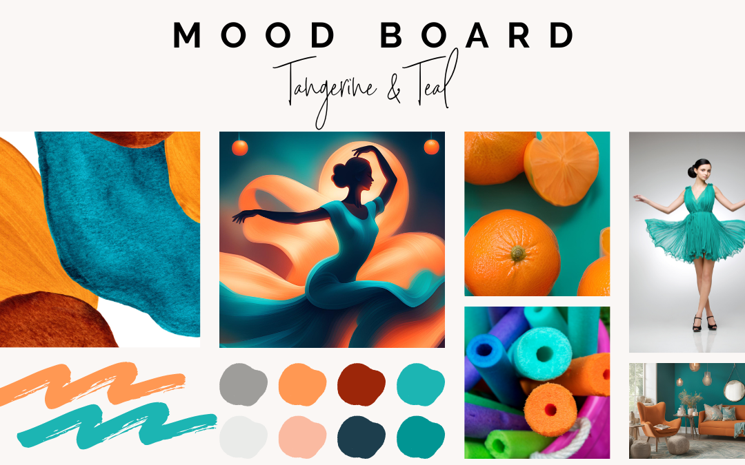
- Teal: Often associated with calmness, creativity, and sophistication. It’s a great choice for artists looking to convey creativity and tranquility.
- Orange: Symbolizes energy, enthusiasm, and warmth. Ideal for dance studios and fitness companies wanting to create a lively, energetic atmosphere.
2. Choose a Dominant Color
Select a dominant color that represents your brand’s personality. This color should be used consistently across your website, including in your logo, headers, and primary buttons. The dominant color sets the tone for your brand and helps create a cohesive look.
3. Use Complementary Colors
Once you’ve chosen a dominant color, select complementary colors to enhance your design. Complementary colors are opposite each other on the color wheel and create a visually appealing contrast. For example, pairing teal with a warm orange can create a balanced, eye-catching look. Use these complementary colors for accents, such as call-to-action buttons, links, and highlights.
4. Maintain Balance with Neutral Colors
While bold colors are essential for creating a vibrant online presence, it’s important to balance them with neutral colors like white, gray, or beige. Neutral colors provide a clean backdrop that allows your bold colors to stand out without overwhelming the viewer. Use neutral backgrounds and text to maintain readability and ensure your bold colors pop.
5. Prioritize Readability
Bold colors can enhance your website’s visual appeal, but they should never compromise readability. Ensure that text contrasts well with the background. For example, if you have a bold orange background, use white or black text to ensure it’s easy to read. Avoid using too many bold colors in text as it can be hard on the eyes and detract from the user experience.
6. Use Bold Colors to Guide Attention
Bold colors are excellent for drawing attention to important elements on your website. Use them strategically to highlight calls to action, key information, or areas where you want users to focus. For example, an orange “Sign Up” button will stand out against a teal background, making it more likely that visitors will take action.
7. Test and Iterate
Color preferences can vary among different audiences, so it’s essential to test your color choices. Use A/B testing to compare different color schemes and see which ones resonate best with your audience. Gather feedback and make adjustments based on user behavior and preferences. Remember, creating an effective online presence is an ongoing process that requires regular updates and refinements.
8. Be Consistent Across Platforms
Ensure that your use of bold colors is consistent across all online platforms, including social media, email newsletters, and marketing materials. Consistency helps build brand recognition and reinforces your brand’s identity.
Using bold colors effectively can transform your website into a vibrant, engaging space that attracts and retains visitors. By understanding the affects of color on your audience, choosing a dominant color, using complementary and neutral colors, prioritizing readability, guiding attention, testing, and maintaining consistency, you can create an online presence that truly stands out. Embrace the power of bold colors and watch your online presence come to life!
Ready to get started?
If you’re looking to add some bold colors to your dance studio’s website, book a complimentary discovery call today!